Case Studies

Detailed Client Case Studies

Real project breakdowns focused on strategy, design decisions, execution, and measurable results.

Featured Signature Case

Coffee Shop Growth Case Study

A complete breakdown of the strategy, design decisions, and measurable result behind a hospitality-focused conversion redesign.
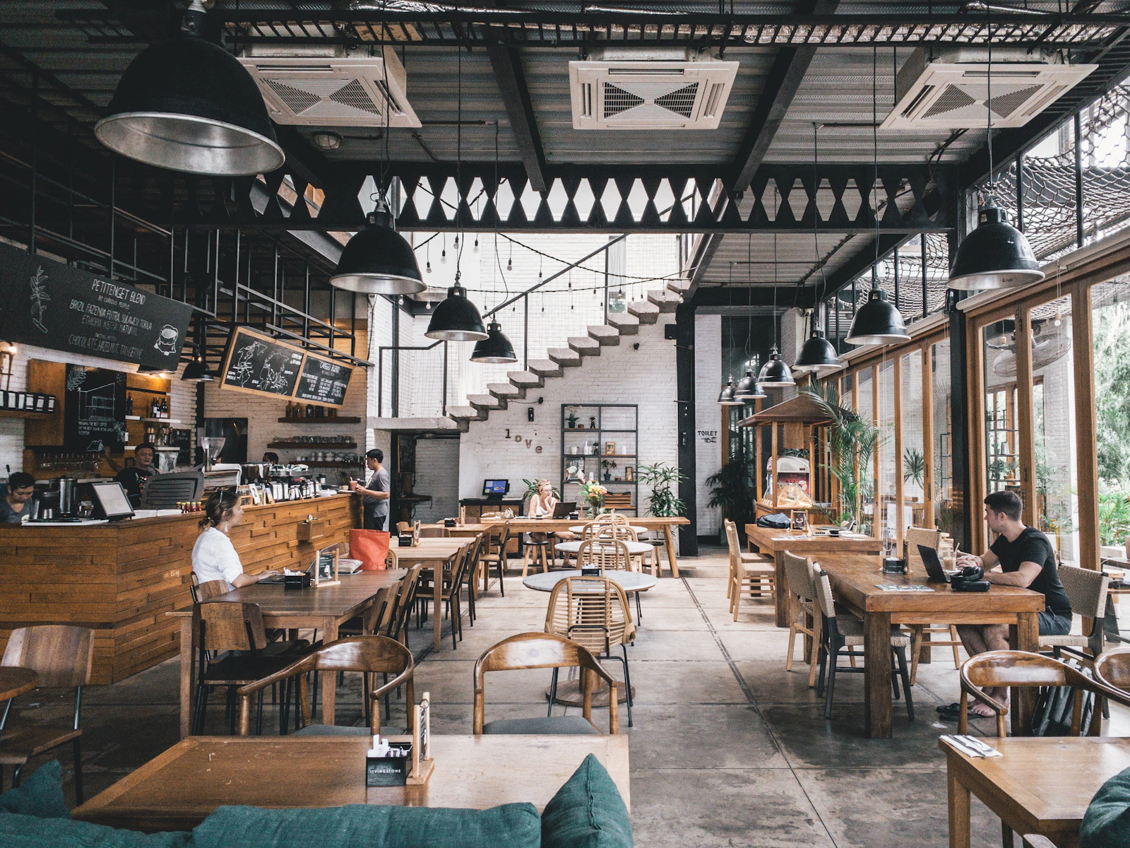
Cafe counter with customer seating

Case Study 1 | Hospitality

Neighborhood Cafe Refresh

A full homepage and booking-path redesign focused on helping first-time visitors decide faster, understand the cafe vibe, and reserve a table without friction. The project included homepage architecture, menu preview strategy, mobile navigation behavior, and conversion-first copywriting.

Problem The original site had low contrast text, no clear reservation path, and important details like hours and location buried below the fold. New visitors frequently called for information already on the site, which signaled poor hierarchy and weak scannability. The owner also reported weekday traffic dips because lunch visitors could not quickly confirm wait time expectations.
How I Fixed It I rebuilt the page structure around a sticky reserve button, summary cards for hours and parking, and a simplified 3-step booking flow. I also added a menu highlight strip by daypart, prominent social proof near the first call to action, and a mobile-first jump menu that lets users skip directly to reservations, location, or menu in one tap.
Design Decisions and Why I used warm photography and short headline blocks to match the in-person atmosphere, then placed trust markers near CTAs so users could make decisions without hunting for proof. Type scale and spacing were tuned to prioritize speed-reading for on-the-go users. I chose a high-contrast action color for reservation controls because hospitality users often make quick, intention-driven choices from mobile.
Result Reservations grew by 38% in six weeks, average time to first booking click dropped from 42 seconds to 16 seconds, and calls asking for basic hours/location decreased by roughly 27%. The cafe owner also reported stronger weekday lunch consistency after the menu-first section was introduced.
Product boxes and candles on display

Case Study 2 | Retail

Candle Bar Ecommerce Lift

A conversion-focused storefront refresh that improved seasonal launch performance without increasing ad spend. Scope included category architecture, product page templates, bundle strategy, and purchase-confidence messaging.

Problem Customers were browsing but not buying bundles because product pages did not explain scent profile, burn time, or gift value clearly. Cart abandonment was highest on mobile product detail pages, and buyers were uncertain whether they were choosing the right scent combinations for gifting.
How I Fixed It I introduced scent-family filters, side-by-side comparison cards, and prebuilt bundle blocks that auto-updated based on season. I also added intent-specific pathways such as gift-ready, relax, and clean-home moods, plus clearer shipping and delivery timing directly under add-to-cart to remove purchase hesitation.
Design Decisions and Why Soft neutral backgrounds and tighter typography were chosen to keep product color as the visual hero while reducing decision fatigue across longer catalog pages. I used consistent card dimensions to improve comparison speed and inserted micro-copy near bundle options to explain savings in plain language instead of percentages alone.
Result Average order value increased 24%, bundle conversion improved from 6.1% to 10.4% in the first month after launch, and mobile add-to-cart rate rose by 19%. The brand also reused the new template for holiday drops, reducing launch prep time by about half.
Embroidered apparel display rack

Case Study 3 | Custom Goods

Embroidery Quote Funnel Redesign

A service-led website restructure built to attract better leads from schools, teams, and local businesses. The redesign prioritized quote quality over raw form volume and helped the owner standardize intake before production.

Problem The contact form received many low-detail requests, causing quote delays and constant back-and-forth before production could begin. Many leads did not include garment type, stitch expectations, or desired turnaround time, which led to pricing errors and slower approvals.
How I Fixed It I replaced the generic form with a guided quote builder that asked for garment type, stitch count, quantity range, deadline, and artwork upload in one flow. I added dynamic helper text and example photos at each step so non-technical buyers could choose options confidently and submit accurate requirements.
Design Decisions and Why I organized content into use-case pathways (teams, business uniforms, spirit wear) so visitors could self-select quickly and see relevant examples before asking for pricing. I chose a progress indicator for the quote form to reduce abandonment and used plain-language labels instead of industry jargon to keep the experience friendly for first-time buyers.
Result Qualified inquiries rose 47%, average quote prep time dropped from 18 minutes to 7 minutes, and revision rounds per order fell meaningfully because initial submissions were more complete. This let the shop handle higher weekly volume without adding admin staff.
Professional service team collaborating in office

Case Study 4 | Professional Services

Local Law Office Trust Rebuild

A credibility-first redesign aimed at turning uncertain visitors into confident consultation requests. This project emphasized authority signaling, expectation clarity, and faster access to practice-specific answers.

Problem The firm had strong referrals but weak web trust signals, with outdated bios, no clear practice breakdown, and thin proof of outcomes. Prospective clients reached the site during stressful decision windows and could not quickly confirm whether the firm handled their exact case type.
How I Fixed It I created a clear practice-area architecture, added attorney profile modules with certifications, and built a consultation page with expectation-setting copy. I also introduced a frequently asked questions framework by case type so visitors could answer immediate concerns before contacting the office.
Design Decisions and Why I used high-contrast type, restrained color accents, and structured content blocks because legal visitors prioritize clarity, authority, and emotional stability over decorative visuals. Section order followed user anxiety patterns: Do you handle my issue, can I trust you, what happens next, and how soon can we talk.
Result Consultation form completion improved 31%, bounce rate on practice pages dropped by 22%, and average session depth increased because visitors moved through attorney profiles and relevant practice pages in a more predictable sequence.
Residential cleaning team preparing supplies

Case Study 5 | Home Services

Residential Cleaning Lead Upgrade

A local SEO and conversion rewrite that helped a service business generate more recurring clients. Work included homepage restructuring, city landing page consistency, quote-form improvements, and service package positioning.

Problem Traffic was strong from map listings, but visitors were unsure about service areas, package differences, and what happened after submitting a request. High-intent users were leaving before conversion because key trust details and process steps were unclear on first view.
How I Fixed It I rebuilt the homepage around service-area proof, transparent package tiers, and a fast quote form with preferred date and home-size selectors. I added expectation-setting copy around response times, arrival windows, and first-visit checklist details so clients understood exactly what would happen next.
Design Decisions and Why I used before-and-after visual sequencing and plain-language copy to reduce uncertainty, since household services convert best when outcomes and process are immediately understandable. Pricing cards were intentionally simple and anchored to room count ranges to help users self-qualify without forcing phone calls.
Result Monthly recurring bookings increased 29%, lead quality improved enough to reduce no-show estimates by 18%, and quote-to-booking conversion improved because users arrived with clearer expectations around package fit and scheduling.
Restaurant team preparing service during dinner shift

Case Study 6 | Restaurant

Family Restaurant Online Reservation Boost

A local restaurant redesign focused on dinner reservation growth and better event-night visibility. The project included navigation simplification, menu architecture, reservation UX, and conversion-focused local landing modules.

Problem Guests were dropping off before booking because the reservation flow was hidden and menu sections were hard to scan on mobile. Event nights were announced on social media, but the website did not support those campaigns with clear landing sections or urgency cues.
How I Fixed It I introduced a fixed reservation action, restructured menu content by meal intent, and added event-ready homepage modules with quick date highlights. I also added trust markers like local reviews and photo proof near booking CTAs so new visitors could decide quickly.
Design Decisions and Why I used stronger spacing rhythm and larger touch targets because restaurant traffic skews heavily mobile and often arrives in fast decision windows. Section order was built around intent sequence: check menu, verify quality, then reserve now.
Result Online reservations increased 34% over eight weeks, event-night table bookings filled earlier in the week, and average clicks to reservation dropped significantly due to clearer access paths.
Dental clinic reception desk with modern interior

Case Study 7 | Healthcare

Dental Practice New-Patient Funnel Redesign

A trust-first website overhaul designed to increase new-patient requests and reduce front-desk qualification calls. Work covered service hierarchy, insurance clarity, provider pages, and appointment flow restructuring.

Problem Potential patients were unsure about accepted insurance, service options, and appointment expectations, causing drop-off before form completion. Staff spent time answering repetitive questions that should have been resolved on the website.
How I Fixed It I rebuilt the information hierarchy around top patient intents: insurance, urgent care, cosmetic services, and first visit details. I added provider credibility blocks, clear treatment pathways, and a simplified appointment request form with intent-specific options.
Design Decisions and Why Healthcare users prioritize reassurance and clarity, so I used concise copy, high-contrast typography, and predictable content blocks to reduce cognitive load. Important trust details were repeated near action points so users did not need to backtrack.
Result New-patient form submissions increased 28% in the first month, front-desk pre-qualification calls dropped, and appointment requests arrived with stronger detail quality for faster scheduling.