Increase in bookings after launch.

Signature Case Study
Northline Coffee Roasters
Neighborhood Cafe Refresh
A conversion-first website redesign for a local coffee shop that needed stronger first impressions, clearer menu flow, and more table reservations from mobile visitors.
Homepage Strategy
Menu Conversion
Mobile Booking Flow
Analytics Iteration
Time to first booking click from home page.
Reduction in calls asking for hours/location details.
Booked tables from site traffic.
Time to first booking click.
Reduced repetitive support calls.
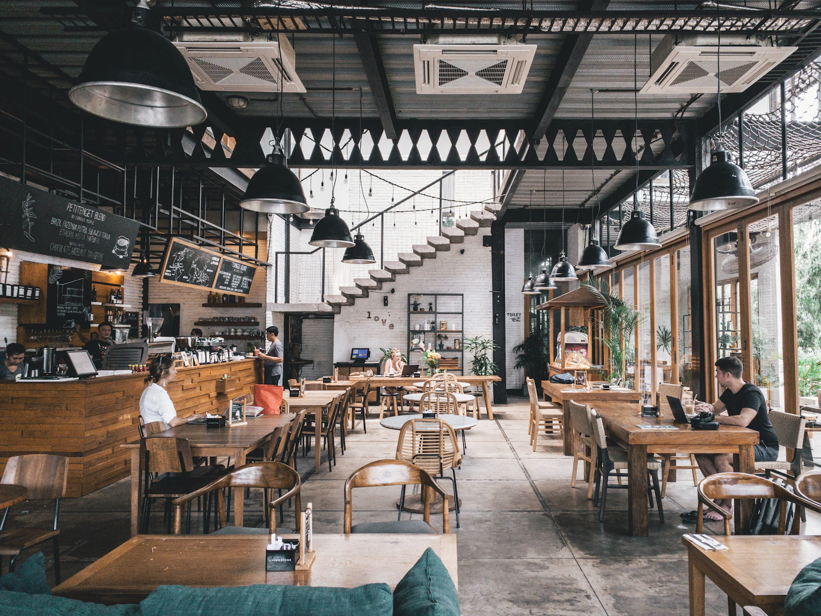
From Pretty Site to Booking Engine
The old website looked decent but underperformed where it mattered. New visitors could not quickly find menu highlights, event information, or reserve buttons. The new system focused on speed-to-decision for both morning and lunch traffic behaviors.
- Before: scattered details, low CTA clarity, weak mobile path.
- After: guided booking flow, trust blocks at decision points, and jump links by user intent.
Built for 10-Second Confidence
The hero was rewritten to answer three immediate questions: what kind of cafe this is, why it is trusted, and where to book. Supporting modules were reordered to match how new visitors scan: atmosphere, menu confidence, social proof, and reservation action.
Daypart Framing by Intent
Instead of one long generic menu, content was grouped by morning, midday, and evening behavior. Each segment included highlight items and a contextual CTA so users could decide quickly without browsing a full PDF-style list.
Proof Near Every Decision
Review snippets, local mentions, and event photos were intentionally placed beside reservations and contact actions. This reduced hesitation for first-time visitors and improved conversion quality from mobile traffic.
Behavior-Led Refinement
After launch, navigation labels and CTA labels were refined using click behavior. Sections that delayed booking clicks were tightened, resulting in faster first action and stronger booking consistency over six weeks.


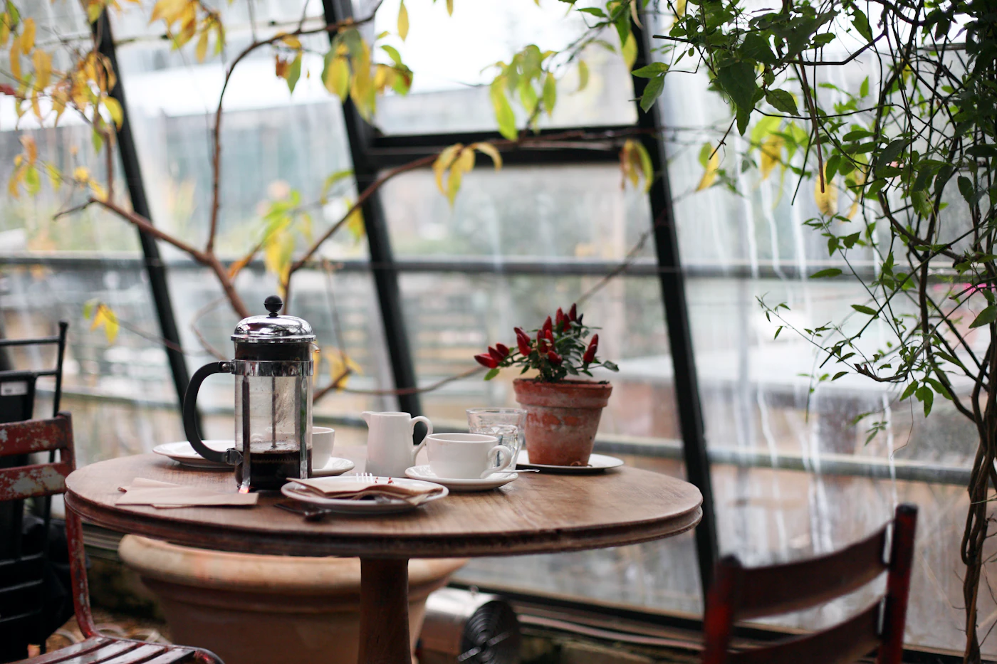
How Visitors Move Through the New Experience
Discover
Visitors immediately see the cafe identity, headline offer, and social proof in the first viewport.
Decide
Daypart menu modules and event previews reduce uncertainty and increase decision confidence quickly.
Book
Sticky reserve controls and low-friction CTA placement convert mobile intent into completed bookings.
Visual Language Decisions
Type Pairing
Editorial headline weight with practical body text to balance premium tone and fast scanning.
Action Contrast
Warm gold CTA states against deep blue surfaces for immediate visual hierarchy and accessibility.
Color Tokens
#D8AB4D
#0F1A28
#79DBD5
#F3F5F8
Weak Path to Action
Key business details were buried. Users had to hunt for hours, parking, and booking options. Many dropped before taking action, especially on phones.
Clear Conversion Architecture
I rebuilt the site around one primary flow: discover quickly, trust quickly, book quickly. Sticky booking controls, daypart menu previews, and social proof blocks were placed at decision points.
Premium But Fast to Scan
Warm photography, elegant typography, and high-contrast actions preserved the cafe's brand feel while making utility information instantly scannable for mobile users.
Higher Intent, Better Conversion
Bookings rose, decision time dropped, and low-intent support calls declined. The website became a dependable growth channel instead of a digital brochure.
Measured Outcomes at 6 Weeks
MetricBeforeAfterImpact
Reservation Conversion4.9%6.8%+38%
Time to First Booking Click42s16s-62%
Info-Seeking CallsHighLower-27%
Execution Timeline
A focused four-phase process designed to improve both look and business performance.
-
Discovery and Traffic Mapping
Reviewed top visitor goals, customer questions, and where drop-off happened across current pages.
-
Information Architecture
Created a homepage structure that prioritized reserve actions, menu confidence, and trust cues near CTAs.
-
Design and Mobile Optimization
Built premium visuals with fast-scanning sections, jump links, and touch-friendly action controls.
-
Launch and Iteration
Tracked first-click behavior and refined section order to improve booking speed over the first six weeks.